Secret flights wanted a new search format for their website, they contacted me and we started getting into it. the new format will be based after the widget the client had on the facebook app chat
the widget is low-fi design, as simple as can be and based on the user interaction by choosing the options presented to him.
That will be our main focus, to make the proccess as simple as possible, while improving the logic and presenting a different flow, depending on his search needs (specific date, timeline, special enevt, etc)
That will be our main focus, to make the proccess as simple as possible, while improving the logic and presenting a different flow, depending on his search needs (specific date, timeline, special enevt, etc)
Who?
our users are varied in age, with a wide common denominator. they are all familiar with a search funtion on these websites, they need the simplest way to get the search result, but they also have specific searches sometimes, which aren't always represented in the regular search moduls.
The problem
how do i present the user various search options, without making it look to crowded, or confusing? how do I present one location for the search function, where every user can look for their specific inquiry?
Our goals
easiest way to search
represent as many search options
avoiding long forms and flows
What did we do?
Using a "main" menu for search categories

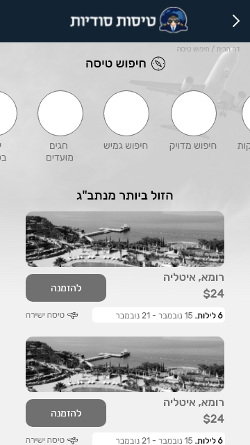
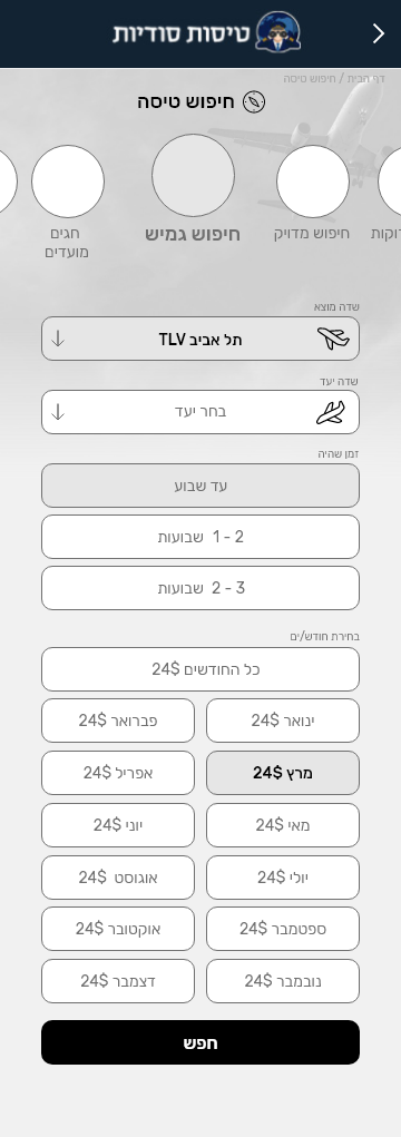
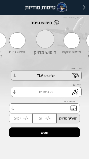
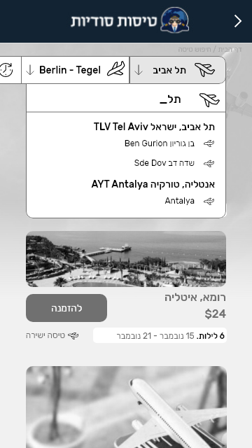

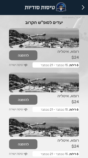
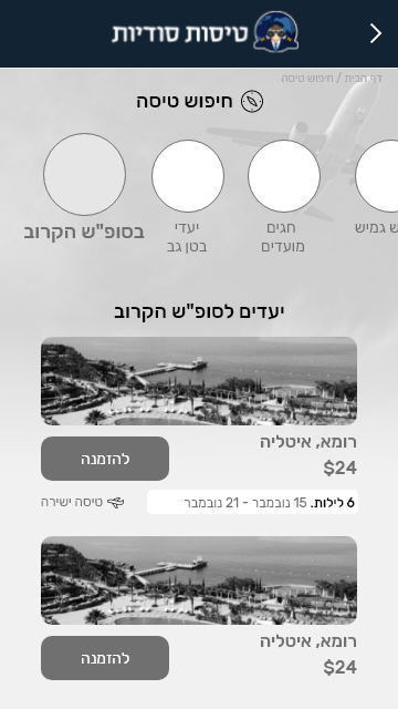
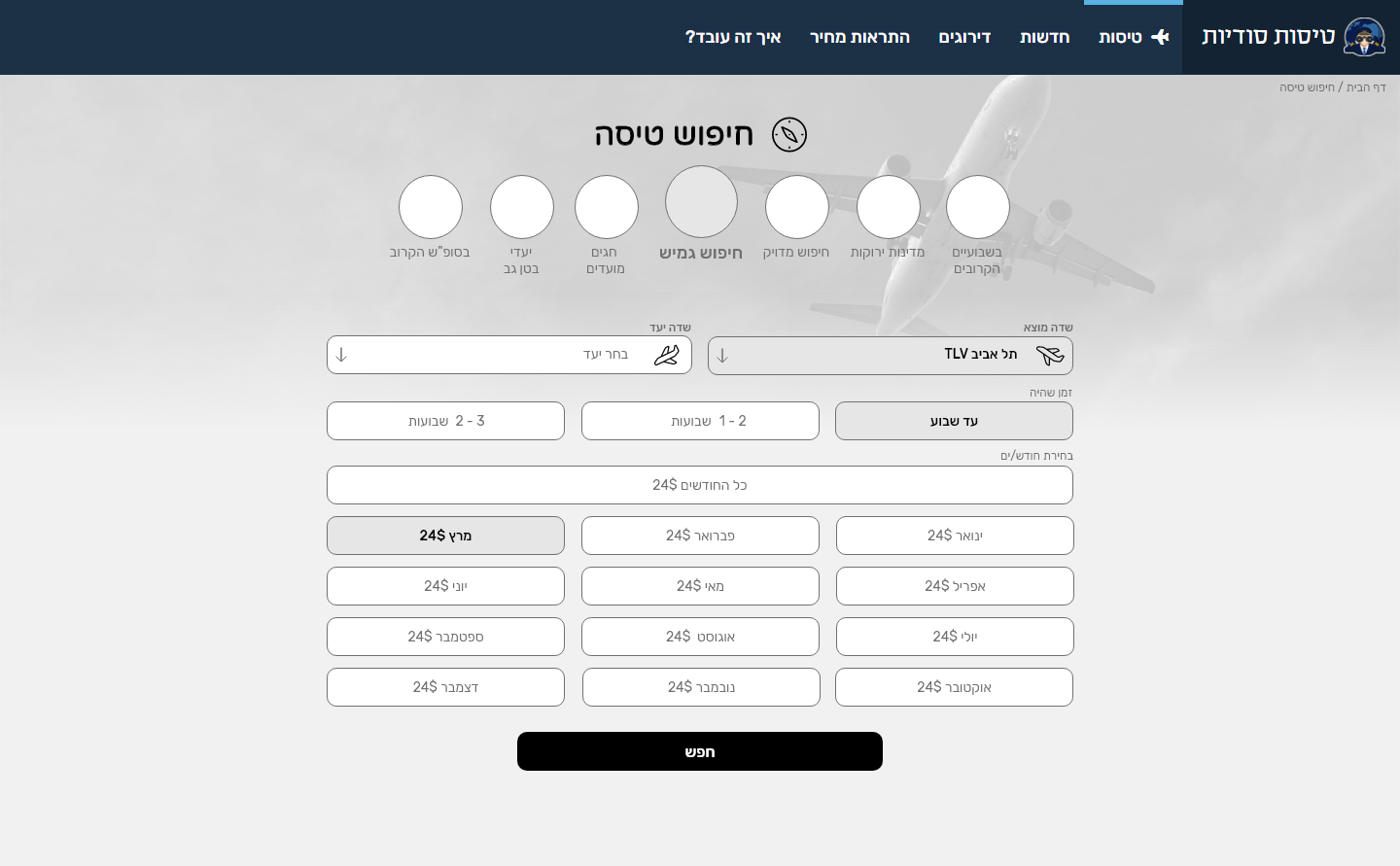
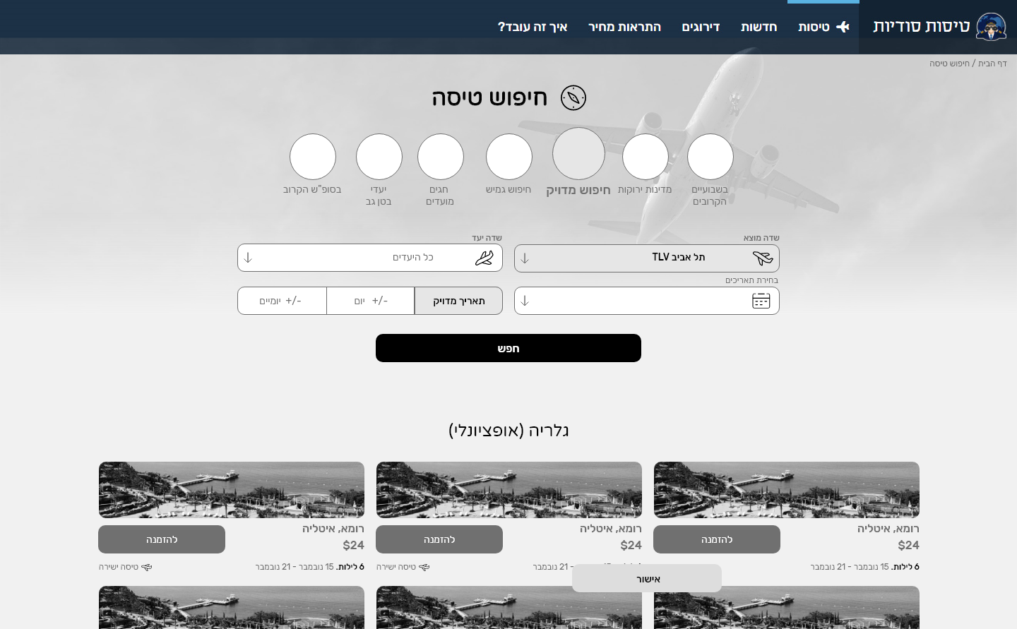
specific flow for every search option. looking for a flight for a general summer vacation isn't the same as finding the next flight to London, where you have a meeting the next day
colors and visuals
The clients website is already designed and branded, so we made sure the keep the colors and tone the same
Final result
mobile

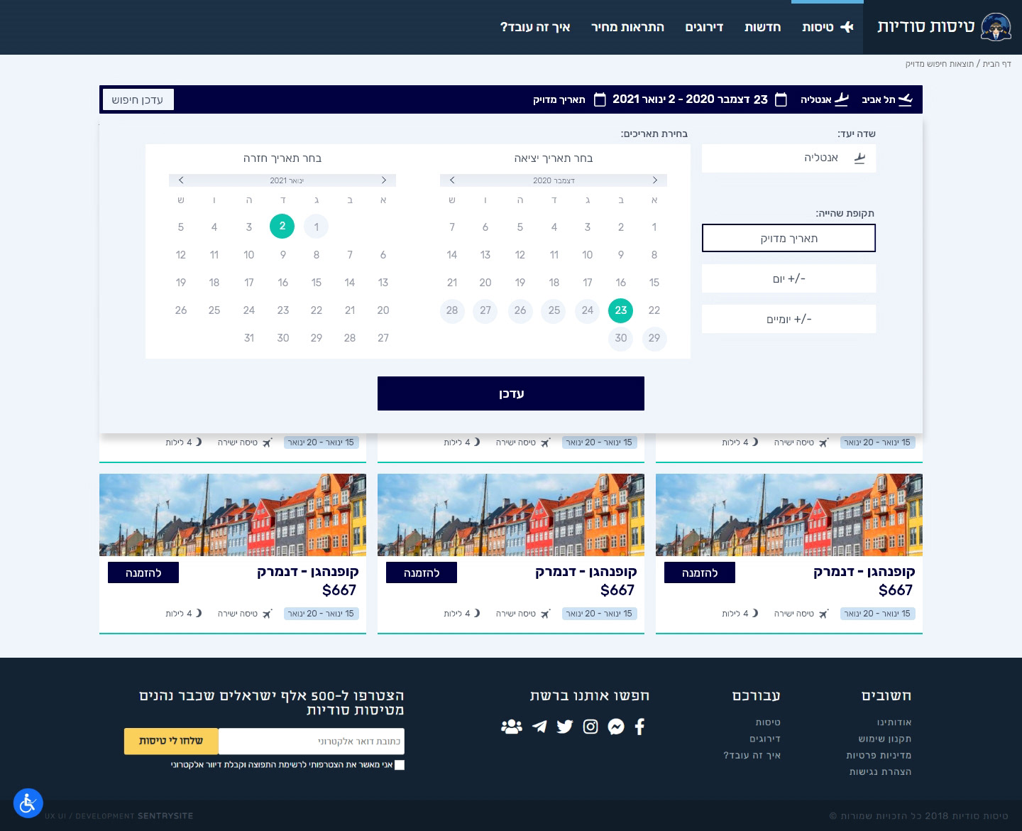
Specific date search

choose destination

choose start / end dates

choose margin

results
desktop
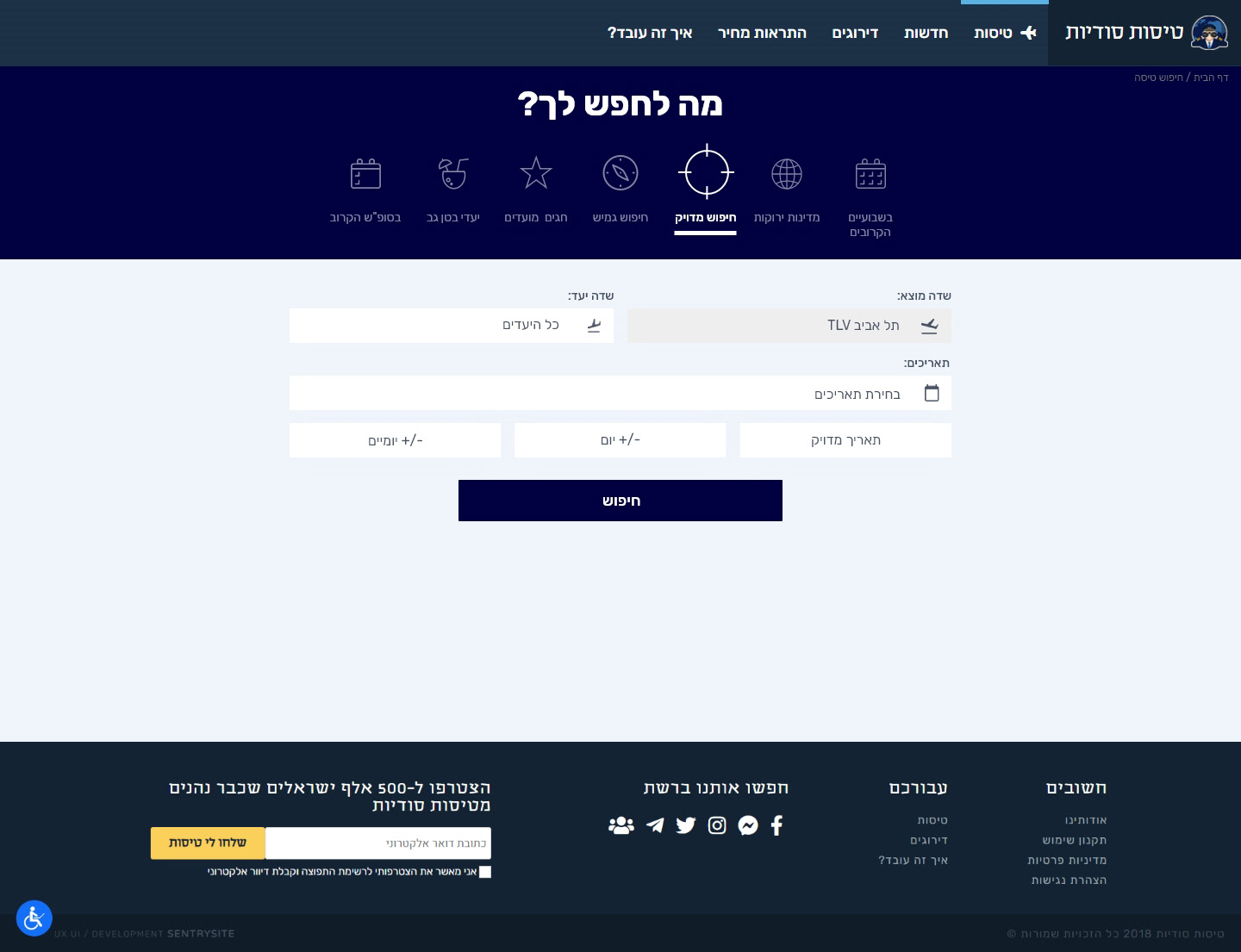
Strat of flexible search
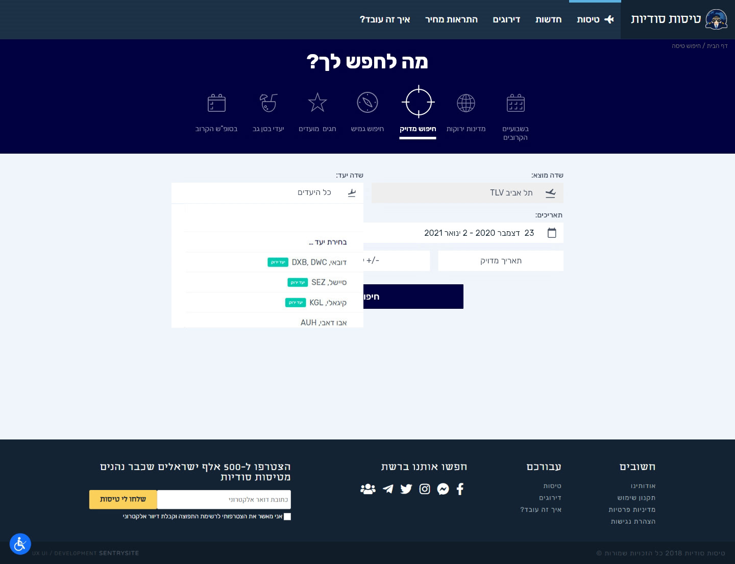
choose destination
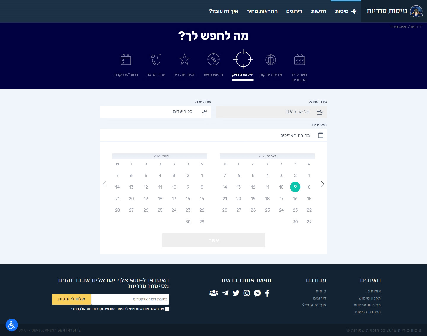
choose start date
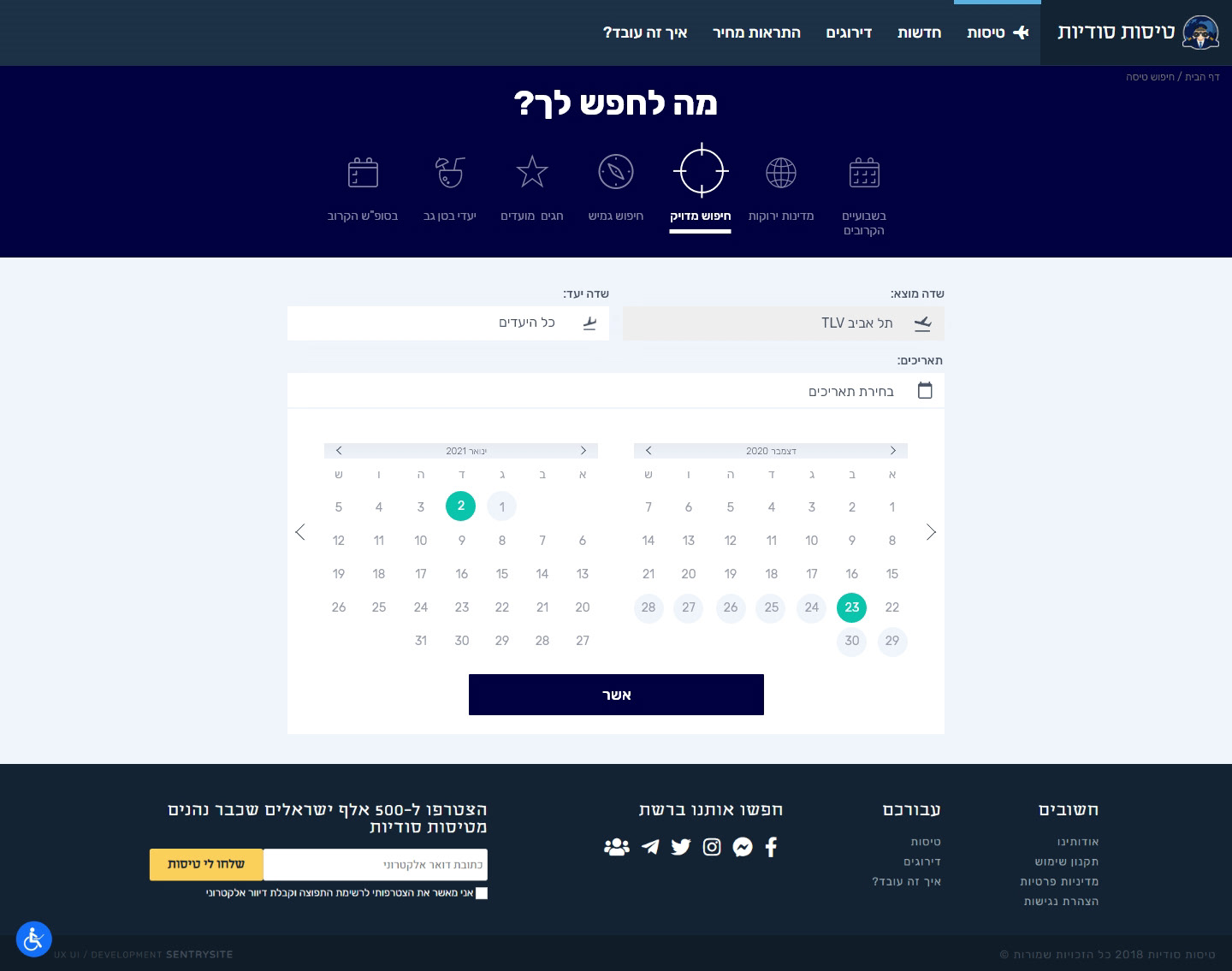
choose end date
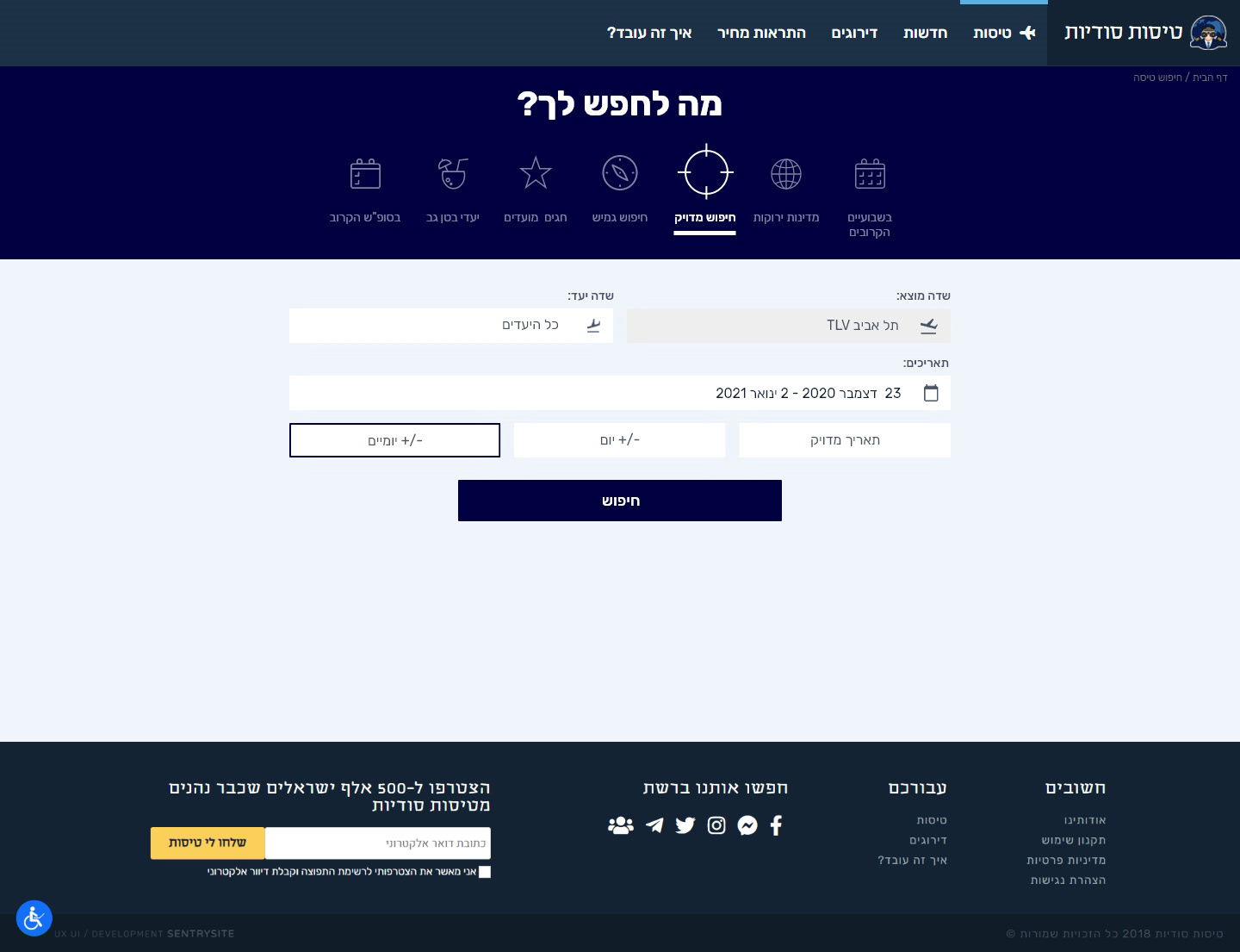
choosing type
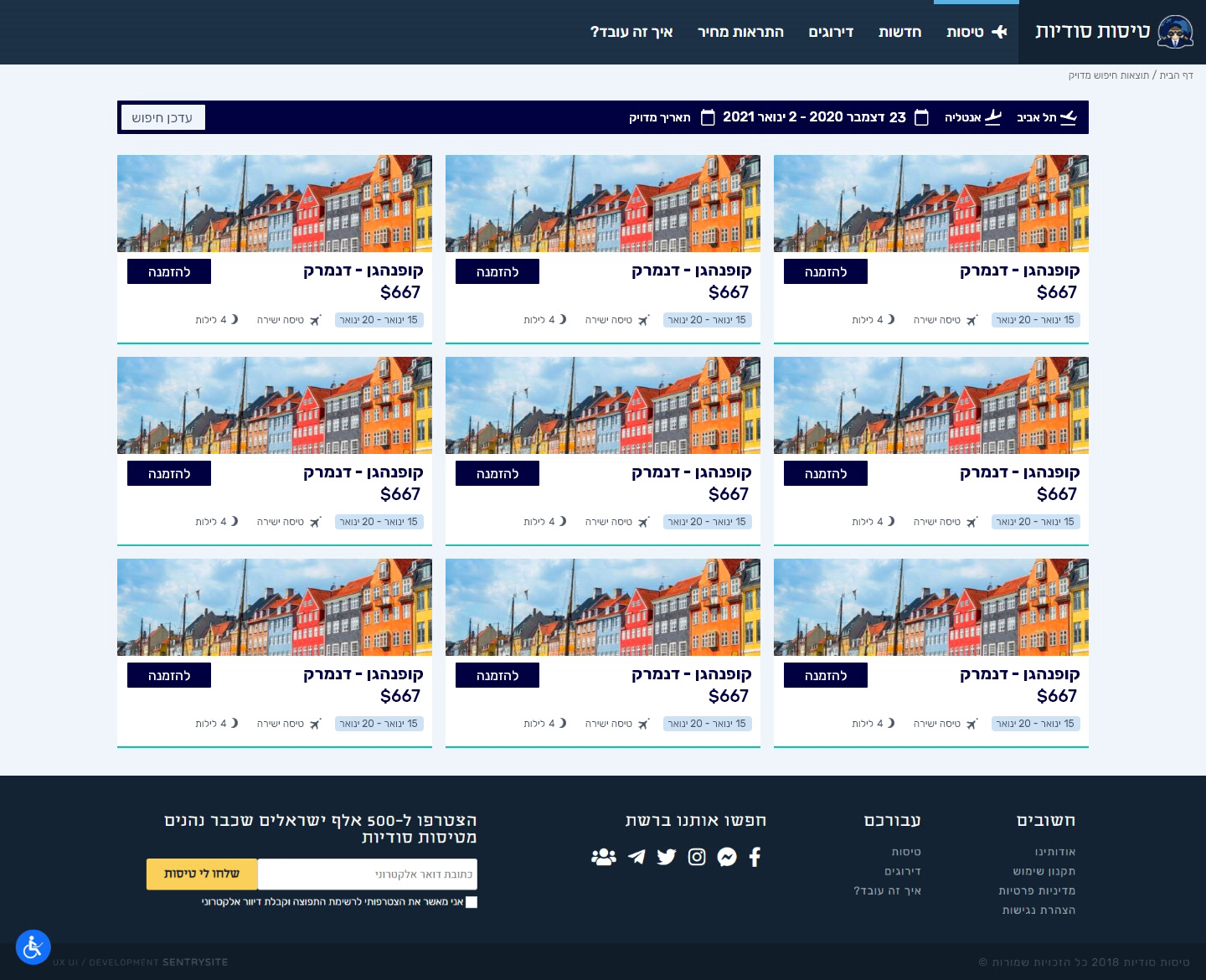
Results
